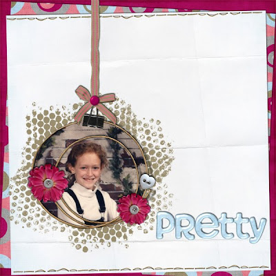
It is so hard to believe that Easter is this Sunday, seems like just yesterday was Christmas. I saw some irises yesterday, so Spring is finally arriving. I'm here today to show you a new kit by Scraps by Andrea called Easter Fun, and boy does it look pretty. I'm anxious to get my hands on it, and I'll be back later to show you some layouts with it, but it is just too cute not to show off now. The image is linked to the store so you can head over and get it right away.
I also noticed last night that I have several layouts I've done for different things that I've not had a chance to blog about, so today is the day. And first up is one of my favorite layouts I've done in a long time. I did it for a song lyric challenge at Polka Dot Plum and the Song was American Honey by Lady Antebellum. I had not heard the song, but found it on line and loved it. The lyrics are great. I used a kit called Chocolate Truffle by Polka Dot Pixels and it fit the challenge perfectly. An my choice of photos just had to be Miss Callie.
My next layout uses the same kit, and was for an "All About Me" challenge. This layout is a rare find on my blog because is includes something I don't normally use on my layouts and that is a photo of me. I'm trying to get better and at least occasionally scrap a photo of me or as in this case half a photo of me (hehehe), since most of what you see is Tucker.
Now for a layout I did using a kit by Polka Dot Plum Designs called "My Little Claire". I love the colors of this kit, and the element are great as well (lots of flowers). I actually did two layouts with it. The first is Angela, and the photo is of her on a Saturday before her Upwards Cheering, taken about 3 years ago.
My second layout with the kit is Callie and Sharla after church one Sunday about 6 months ago. Sharla is more willing to pose (not much more, but more) when she can pose with Callie or Cole. I did this for a template challenge, and really like how it looks.
My last layout for today, just because I'm tired of typing, not because I don't have any more to show you is one I did with Sir Scrapalot Designs kit called Spring Symphony. The photos are from our recent snow day ok snow morning on March 20th. Can you believe how much snow we've had this year in Texas. I know all ya'll yankees are saying we're wimps, but I'm just not used to this much snow. It is pretty, but I like my mild winters. I love the snow against these pink flowers. This was also for a template challenge at Polka Dot Plum.
I'll be back tomorrow with more.
Wednesday, March 31, 2010
Tuesday, March 30, 2010
Food Of Love Freebie
Good Morning all, I hope everyone is having a great week so far. It is beautiful here, Spring is definitely in the air. I can't wait for the irises to start to bloom. They are just beginning to bud, so hopefully soon.
Today I'm going to offer you a freebie, a quick page made with the collab by Digi Designs by Nicole and Scraps of Ellay called Food Of Love. It is a beautiful kit that is great for all kinds of layouts, and includes some great word art. I included one of them on the quick page. I hope you enjoy and don't be shy about leaving love. The image is linked so just click on it and you'll be taken to the download page.
Don't forget to head over to Nicole's Blog to pick up some other quick pages from her and my other CTs. Also you should mark your calendar for a Speed Scrap led by Nicole on April 1st. Below you'll see all the info as well as the a preview of the participation prize (and it is very very cool).
I'll be back later in the week with more stuff to show you. :)
Sunday, March 28, 2010
Food Of Love
Hi all, I'm here today to show you a new collab kit by Digi Designs by Nicole and Scraps of Ellay called Food Of Love. The fabulous colors, the musical elements, and the huge collab kit make this kit perfect for, well, anything. I loved playing with this kit.
My first layout is Mom and Dad, taken years ago in front of Niagara Falls. It's funny they were married for over 50 years, but are not in that many pictures together. I have pictures of Dad, and pictures of Mom, just not a ton of the two of them together. I love all the flowers in this kit, they are really pretty.
My second layout is Cole taken just before a school recital. He played the cello in the fifth grade (I think it was fifth). When I saw the violin element I knew right away what photo I wanted to use. It is a simple layout, but I really like that the elements were so cute.
So make sure you head over to Stuff to Scrap and pick up Food Of Love soon, you'll love it. And come back on Tuesday for a Quick Page Freebie.
Friday, March 26, 2010
This Little Missy's Template Pack 1
No I'm not talking about Callie or Sharla, although I'm pretty sure both have been called Little Missy at some point in their lives, probably by me (hehehe). I'm talking about one of the new designers at Stuff To Scrap and her store name is This Little Missy and she was one of my assigned designers. I chose her template pack to work with, because I'm really starting to like templates. When I first started digital scrap booking I didn't really understand how to use them, or how much benefit they could be. I'm totally in love with them now, and this set is great because it has a mixture of single photos and multiple photo layouts.
My fist layout is Callie and Honey taken at Thanksgiving. The photo is one Sharla took, and I love it. I love how Honey just laid down with Callie and put her head on her, like she was protecting her. They may not have been together for years, but they are definitely best of buds. The kit I used is From the Heart by Digi Designs by Nicole. I love the simplicity of the template, but also that it mixes shapes.
My second layout is Tucker Joe, also known as my sweetheart. I really stretched myself with this template, because I like things all lined up nice and neat, and the paper strips are slightly askew on this one. I do love that it uses lots of paper, because I like to do that, and I think the layout came out great. The kit is Sweeter than Candy a mega collab by Stuff to Scrap.
You should hurry over to Stuff to Scrap and pick up This Little Missy's Template Pack 1 soon, you'll love the layouts you can create with it.
Tuesday, March 23, 2010
Hippie Chick Freebie
Hi all, it is a short post today, because I have to take mom to the doctor, get tags for the van, and grocery shop. It is great to be off on Monday and Tuesday, but it also means my "weekends" are very busy.
Today you get a freebie quick page made with the collaboration by Digi Designs by Nicole and The Scrappy Kat called Hippie Chick. This is such a fun kit, it just makes you smile. The image is linked so just click and download.
Make sure you visit Digi Designs by Nicole's Blog to get the links to her other CTs who have done freebies as well. And then head over to Stuff to Scrap and pick up Hippie Chick for your stash. And I promise to have more layouts later in the week.
Monday, March 22, 2010
Crazy About Camping & A Freebie
Yes I am Crazy About Camping, ok so those that know and love me know that is not exactly the truth. I'm am however crazy about Scraps by Andrea's new kit called Crazy About Camping. Now I'm not much of a camping girl, but the colors in this kit are wonderful and the elements are just too cute.
My first layout is about what I consider camping. I don't have lots of camping photos, because I don't camp. So I had Sharla stop and take a couple of pictures on her way home of what I consider camping. Yep it the world's famous Motel 6, that is roughing it for me. I love that this kit even has a couple of flowers in it, so you can do any type of layout with it.
My second layout focuses on the only thing I do like about camping and that is the smores. I love them, there is nothing as good as a nicely toasted marshmallow with chocolate and graham crackers...yummo.
I created a Quick Page from the second layout and am giving it away to you today. The image below is linked so just click on it to download it. As always be sure to check Andrea's blog because she and my fellow CT members will have other QPs for you as well. I've just barely touched on all the wonderful elements and papers in this kit, so if you are at all the outdoors person make sure you head over to Stuff to Scrap to get Crazy About Camping soon.
And be sure to come back tomorrow for another freebie.
Sunday, March 21, 2010
Hippie Chick
No this post is not about my tye dye shirts, although I love tye dye. I'm here today to tell you about a new collaboration by Digi Designs by Nicole and The Scrappy Kat and it is called Hippie Chick. The bright colors and funky and fresh embellishments make this kit truly unique. You will just love it.
My first layout is Tina posing by the rooster on the carousel. Sharla and I had visited the carnival the night before but the carousel looked lonely without someone on it. Tina agreed to ride it for us, but then they wouldn't let her because she was too tall. But they did let her pose next to it for us. She even pretended to kiss it. She is a silly girl...maybe that's why I like her so much. The papers in this kit are so pretty, I love the top paper I used here.
My next layout is Miss Callie Y., she had labeled this picture, going to the Derby. She does look like she could rub elbows with the best of them at the Derby. But then she fits in everywhere. The title is word art that is included in the kit, and it describes Callie perfectly.
So make sure you head over to Stuff to Scrap and get Hippie Chick soon and then be sure to come back this week, on Monday I'll be showing another kit with a free QP and then on Tuesday there will be a QP from this kit.
Friday, March 19, 2010
Happy Birthday Callie!!!!!
It is so hard to believe that Callie is 22 today. It seems like just yesterday she was born, she was such a sweet baby. Of course that all changed when she learned to talk...just kidding, she was and is a great kid...yes she will always be a kid to me. Sharla and I called her at 7:00 am this morning to wish her a happy birthday and although she heard the phone ring, she didn't answer because "she doesn't take calls or texts before 8:00 am". She is one of a kind and I love her so much.
I recently was offered a position as a CT member for Polka Dot Plums store. That means I get to work with lots of different designers, which is way cool for me. I have some layouts to show you that I've done with their products and the first two have to do with the birthday girl. The kit is So Natural by The Design Girl, and I done a baby layout and a more recent layout.
She has grown into a beautiful woman!!!!
Next I have a layout done with Pink Peacock Designs kits called The Chronicle-ist Reload and Lazy Daisy Alpha. I love the bright colors in the kit and the alpha is just too cute. The photos are Sharla taken at Christmas. She was taking a picture of Mom and I was taking a picture of her, seems like there was a lot of snapping going on in the room.
The next layout uses Sweet Tomato Designs kit called "The Princess" and I love the soft colors in this kit. When I saw the name, I just knew I was going to use Princess Zoey LeRue in the layout. I did it as a template challenge in the forums at Polka Dot Plum, and I really liked how it looks.
And the last one I'm going to show you for now is Sharla again. It uses Sir Scrapalot Designs kit called Spring Symphony, that is so much fun. It has lots of flowers (my favorite), but some great frames, and papers and everything is just perfect for spring photos.
I'm sorry I don't have the links to these kits, but I don't have them in my cheat sheet yet. But feel free to click on the Polka Dot Plum blinkie on the left side of the page and it will take you to the site where you can find them. And one more time HAPPY BIRTHDAY CALLIE!!!! I LOVE YOU!!!!!
Thursday, March 18, 2010
Flower Patch
Hi all, I hope everyone is enjoying the spring weather, well if it is spring weather where you are. I know it is so nice that the sun is shining and the temperatures are mild. It just screams spring is almost here. Something else that screams spring is a new kit by Scrappin' Daisies Designs and it is called Flower Patch. The kit is full of pinks, purples, yellows, blues and greens and is just a happy kit. I really love the papers in this one, there are 25 different papers and over 50 elements.
My first layout is my fashion diva, taken a few years ago. I look at these pictures and it is so hard to imagine she will be 22 tomorrow. She loved dress up then and she loves it today too. To hear her talk this is as close I'll get to seeing her in a wedding dress for a long time.
My next layout is of Sharla and Cooper, taken at Callie's house on Thanksgiving day. I really love all the colors in this kit, they are spring colors but not overly pastel. And there is enough mix they are good for any type of layout.
So head over to Brownie Scraps and pick up Flower Patch, it is on sale for 35% off through this weekend. Come back tomorrow and I'll have more stuff to show you.
Wednesday, March 17, 2010
Happy St. Patrick's Day!!!
I hope you remembered to wear green and that you're not over indulging in green beer. To help celebrate the day, Stuff to Scrap is having a sale (woo hoo...who doesn't like a sale).
Just click on the flier and it will take you to the store. Lots of great new kits like Digi Designs by Nicole's Tenderly or Scraps by Andrea's A Little Bit of Luck. I'll have more later.
Tuesday, March 16, 2010
Tenderly & A Freebie
Tenderly is a pretty new kit by Digi Designs by Nicole. It is a mix of pinks, blues, tans and greys, so it works for all kinds of layouts. I love the colors, they just make photos pop on the papers.
My first layout is Miss Callie Y. I think it is one of her school pictures, I'm not exactly sure how old she is but I'm guessing about 10. She has always had a great smile, and luckily she is almost always willing to share it. I really like the shiny blue alpha in the kit, so I just had to use it.
My second layout is Cole, Callie and Mom taken at Thanksgiving a couple of years ago. I'm not sure who was having more fun, Callie sitting on Mom's lap, Cole for laughing at them, or Mom for being the center of their attention.
I liked the second layout best, so I made it into a quick page for you. The image below is linked. Make sure you head over to Digi Designs by Nicole, where you'll find links to Nicole's team for more QPs.
And after picking up some great QPs, head over to Stuff to Scrap and get Tenderly for your stash.
Monday, March 15, 2010
Bohemian Chic
I love Daylight Savings Time about a week after it starts, but day one and two are rough. But enough boring stuff, I get to show you a new kit from ModernJune Creations and it is called Bohemian Chic . It is an eclectic kit full of surprises so your layout possibilities are endless. The kit has richly textured papers, unique patterns, elements from plastic to felt to inked and three alphas, all different fonts.
My first layout is my fur babies, also know as love bugs. Both Cooper and Zoey are afraid of storms, so in the spring they are really love bugs. Just this morning, it was nice out, but I think a storm must be coming in because I had some great snuggle time with the babies.
My next layout is Tina, and she is not kiss a chicken...there maybe layouts of that later...hehehe. We were at the park and she was messing with Angela and got to laughing so hard she could barely breath.
The kit has lots of fun elements and was lots of fun to use. You can pick it up at
Digi Scrapbook Mania or Pretty Scrappy and will be available at Ginger Scraps later this week. Be sure to come back tomorrow for another new kit and a freebie.
Saturday, March 13, 2010
Ladybug Picnic
Have you been over to Stuff to Scrap and seen all of the new designers? They had a design contest last month and have added about ten new designers. I was assigned Charm City Scraps this month and Tracy is one of the new designers. She let me have my choice of the items in her store and I picked a kit called Ladybug Picnic which is a cute kit of red, black and white. I love the color combination and the cute little lady bug elements.
I created two layouts with it, the first being, a picture of my Grandmother. It was taken years ago, but thought it was perfect for the papers in this kit. I also used the font that is in the Font Challenge at Stuff to Scrap. The font is call MF Pork Chop (for some reason I just love that name). The papers in the kit have a country feel to me, and I love it.
My second layout is Callie in her red shoes. She was having such fun modeling them. I used the selective coloring so they would pop on the page. It is the reason I used the black paper as well. I love to use touches of black on a layout, but rarely do I use this much black, but I thought it came out really well.
Ladybug Picnic is a fun kit that is great for all kinds of layouts, you should head over to Stuff to Scrap and get it soon.
Friday, March 12, 2010
A Little Bit Of Luck & A Freebie
Isn't that something we all want, just A Little Bit Of Luck, well today you can get it at Stuff to Scrap. It is a great new kit by Scraps by Andrea and I love it...you maybe able to tell that since I used it to create my blog background and header. I love that it has green, teal and brown, they all go so well together.
My first layout is Tom and Mecca and I used the brown for the background. I think it made the greens on the page really pop. I love this picture of them together, plus it is actually a good picture of Mecca. We've been taking her picture for over 20 years and for a beautiful woman, she is hard to photograph (she closes her eyes way too often).
My next layout is Sharla...I have been on a Sharla role for a week or two, seems like every other layout is her....she doesn't like it....but I do...hehehe. In this layout I used the teals, to show how versatile this kit really is. It takes on a totally different look on this page. This photo is from the summer of 1995 and Callie notice she is not wearing the striped shirt (inside joke).
I liked this layout so much that I make it into a Quick Page for you as well. The image below is linked, so just click on it and download. I hope you enjoy it and if you like feel free to leave a comment or two.
Well be sure to head over to Stuff to Scrap and pickup A Little Bit Of Luck, it is a wonderful kit for all kinds of pages. Also make sure you check out Andrea's blog...Scraps by Andrea because she has two quick pages for you as well as links to all of her CT who have some as well. And I'll be back soon with more pages and maybe even another freebie. :)
Thursday, March 11, 2010
Cheer
Be of good Cheer...ok maybe I'm stretching it a little here. But I have a great new kit to show you called Cheer from Shel Belle Scraps. As a member of the CT for the Stuff to Scrap Store, I am assigned 3-4 designers each month. I contact them, they tell me which kit they would like me to use. Well Shel said I could pick any of her kits, so I went through her store with a fine tooth comb. I love her stuff and have quite a few of her kits already. I narrowed it down to two kits and Cheer won because I love the colors. Let me tell you I made the right choice, I love this kit, great colors, lots of elements,including five flowers (I love flowers).
My first layout is Sharla and Callie and the photos were taken when we went to North Carolina a couple of years ago. Callie in her big sunglasses, that girl definitely knows how to rock those glasses. I love the papers in this kit, and I thought they worked well with the photos.
Next is one of my favorite subject, my fur baby Tucker Joe. The photo was taken this summer, and he was laying on the bed looking all sad and I couldn't resist snapping his picture. He is such a good baby. I really like the colors of this kit with the black and white photo.
So head over to Stuff To Scrap soon and pick up Cheer for your collection soon. I'll be back tomorrow with a St. Patricks kit and a freebie.
Monday, March 8, 2010
Shabby Chic
Shabby Chic is a great new kit by Digi Designs by Nicole. A beautiful kit with soft colors that works well for about any picture. Whether wedding, baby, family, girl or boy, it's soft colors will make your pictures pop! I really love all the elements in this kit.
My first layout is Callie and Daddy. I really love this photo of them together. She definitely held the keys to his heart, she had him wrapped around her little finger. The colors in this kit are great, they are subtle, but still striking.
My second layout is Sharla and Mom. I tinted the photo pink, but I think I may go back and change it back to natural. I love the mix of papers in this kit, not to mention all the cool elements.
You should head over to Stuff to Scrap and pickup Shabby Chic because it is 30% off this week. I'll be back later with more.
Watermelon Crawl & A Freebie
If you drink don't drive do the Watermelon Crawl. Everyone should be glad you can't hear me sing as I type this post (hehehe). Well I'm not writing about the song, but about a new kit from Scraps by Andrea. Watermelon Crawl is a bright and fun kit that is perfect for scrapping your little girl! There are 21 papers & 68 elements in this *sweet* kit. Pink and green are one of my favorite color combinations and this kit is just perfect for me.
My first layout I did for the song lyric challenge at Stuff to Scrap. The song is "In My Daughters Eyes" by Martina McBride. A very beautiful song. When I saw the lyrics, I knew right away I wanted a Tom and Callie page. I debated on using an older or new photo, but none of them really had the colors of the kit in them. So with a little photoshop magic, I change the red to green in this photo. I also made this layout into a QP that is available at the bottom of the post.
My second layout is Callie too, but the picture is just a little older. She was wearing the cutest little shirt that had neon pink, neon green and orange bows that fit the kit perfectly. I have to say I love this kit, the papers are wonderful and it has flowers, ribbons, frames, just everything you need to make great pages.
So today you get a QP that I made from my first layout and the image is linked. I hope you enjoy it and don't forget to visit Andrea's blog as well all of her other CTs to pick up more QPs.
And head over to Stuff to Scrap and pickup Watermelon Crawl soon.
Saturday, March 6, 2010
Dude!
No this post isn't about Cole, well it sort is, but it really to show you a kit by The Scrappy Kat called Dude. A kit full of everything teenage boys love; whether they are a rocker, a skateboarder or a biker. It is a collab with Scraps of Ellay, but her portion alone contains 20 papers, 46 elements, & 3 alphas.
I've done two layouts with it, they both feature one of my favorite subjects, Mr. Cole. This photo was taken on Christmas day, he brought over his new guitar to show off. I've not sure he ever mastered the instrument, but he definitely looks cute holding it. I love the guitar element.
Now for a photo from a few year ago, and since he didn't have guitar, he made do with a broom. I guess he didn't have the air guitar down yet...hehehehe. The word art is part of the kit, as well as the grey city skyline both I think are very cool.
Dude is available at Stuff To Scrap and has a companion kit by Scraps of Ellay. I recommend anyone with teenagers get this kit, it is perfect for them. And I still have more for later....
Friday, March 5, 2010
Skirts & Dirt
Ok, it is going to be a short post today, but I love the kit. And can I say officially I love that title, it makes me smile every time I see it. Well Skirts & Dirt is a wonderful collab by ValerieN Designs and Litabells. It is a packed kit with some fun elements, but I have to say I love the papers most.
The layout I did with it was for a scraplift challenge, and I love all the curvy papers. I picked Zoey, because I thought she would look so cute against the pretty colors. The kit has some cute word arts like the princess I used, flowers, ribbons, just everything you'll need.
That's it for today, but there will be much more later I promise.
Thursday, March 4, 2010
Happy Go Lucky
That's me a Happy Go Lucky girl. Ok so maybe it is also the name of a new kit by Scrappin' Daisies Designs. And it is a great kit. I love green and this kit is just packed with it, in several different shades, and is great for those St. Paddy's photos or really just about any photos.
My first layout is of Zoey. It has a recent shot after she was groomed and one of the photos taken on the day we adopted her. She looks so different, and she is acting so different. She has decided that my pillows are the best place in the world to sleep, which doesn't bother me...except when she has been outside digging in the dirt. She still isn't fond of the boys, but she tolerates them and no longer lets them keep her from joining the fun.
My next layout is Angela (my new model) at the park. She was having such fun posing for the photos, and then she had to be cool and throw the deuces. Are you impressed that I know the term throw the deuces? It is amazing what you learn from teenagers (hehehe thanks C & C). But she was being cool and silly at the same time, a great thing for a kid.
Green is a great color because you can use it for boys or girl. Hurry over to Brownie Scraps and pick up Happy Go Lucky, it is on sale right now for 25% off.
Tuesday, March 2, 2010
Whatev!
Happy Tuesday all. I was very excited this weekend when Valerie of ValerieN Designs contacted me about being on her CT. She had reached out last month, but the email must have gotten lost somewhere amongst the vast world wide web. Lucky for me she reached out a second time....yeah me. The first kit I get to show you from her is called Whatev! Mini and is just too cute. I love the colors!!!
I did one layout with it and I used a photo I took of Sharla at Christmas. She was wearing a bright red shirt and that didn't go with the colors so I changed the photo to b/w and I think it looks really good with the colors. I love a kit with lots of flowers and although this is a mini kit, it has 3 in it.
You really should pick up Whatev! Mini today because it is on sale for $1, but that price is only good for a very short time.
And for those family and friends, here are a few more layouts. This one I did for a Super Speed Scrap (everything was sped up). It was fun, but a lot of pressure. I picked photos of Tucker, because it is easy to scrap pages of him (OK, I'm a little partial).
Next is Week 6 of my P52 project. The assignment this week was to photo and scrap about something unusual. Well it just happens that we got nine inches of snow, and there is nothing more unusual than snow in Texas. The photos are Sharla walking out into the back yard, as you can see the snow is quite high on her boots. We were trying to get the dogs out into the snow to take pictures. They would run to her and then turn and run back, it was much too deep for them. The tree is outside of my office, it just looked so pretty that morning.
Now for Week 7 of the project. The assignment was "what's in your wallet", and they expanded that to purse/bag etc. Well I only took a photo of the main things I carry everyday. Most of the time I carry two bags, but these are the things that go with me all of the time.
My last layout today, is not really a layout it is my March Desktop.
That is it for now, I'll be back later this week with more.
Subscribe to:
Posts (Atom)